
The dawn of the infographic
Since the time of the wooly mammoth, humans have been telling stories through pictures. Early humans gave fellow cave dwellers information via the pictures on the walls: where the best hunting grounds were and their latest conquests. Sure, perhaps we’re not out there hunting pre-historic pachyderms anymore, but we still love to tell stories. That’s basically what draw.io is, a place for you to tell your story through diagrams. Maybe you want to make a pie chart to show your company’s market share, or a flow chart to give your team a play-by-play of your most important processes – everyone likes images. So stick around and check out how to increase productivity with infographics in draw.io
Productivity & Infographics
The word infographic is easy to understand – it’s a graphic that gives you information. Scientific research shows that between 60-90% of the information we take in is visual, and when we think, we think in pictures, not words. As we move deeper into the digital world, getting our information visually is also more efficient. We have much shorter attention spans and less time to consume the information.
Visual information is very often less complicated to understand and is universal. Since the Egyptians’ first ad campaign back sometime in 2000 B.C., advertising and marketing agencies rely very heavily on the impact of their visuals to influence our buying habits. It’s clear what they want us to buy without needing to hear a long monologue about the service or product.
Visualization isn’t just relevant in a commercial sense, but also for you in your organization. So many visuals surround us in our day-to-day life that we may not even notice how often we use or need them. For example, when onboarding new employees, think about how often you use flyers, presentations, or diagrams to relay new information. Would your newbie be more overwhelmed by pages of text or by one, clear infographic? Or, the end-of-year financial report is due, are you more likely to use a graph or pages of financial data that your employees have to sift through?
With the right tools, such as draw.io, you can create your very own infographics to get the message of your information across more efficiently. When you look at all of the factors together, it’s clear that infographics can lead to more productivity.
Want to try out the diagram yourself? Either click the Infographic image above or here to open up the draw.io editor!
Tips from our design team
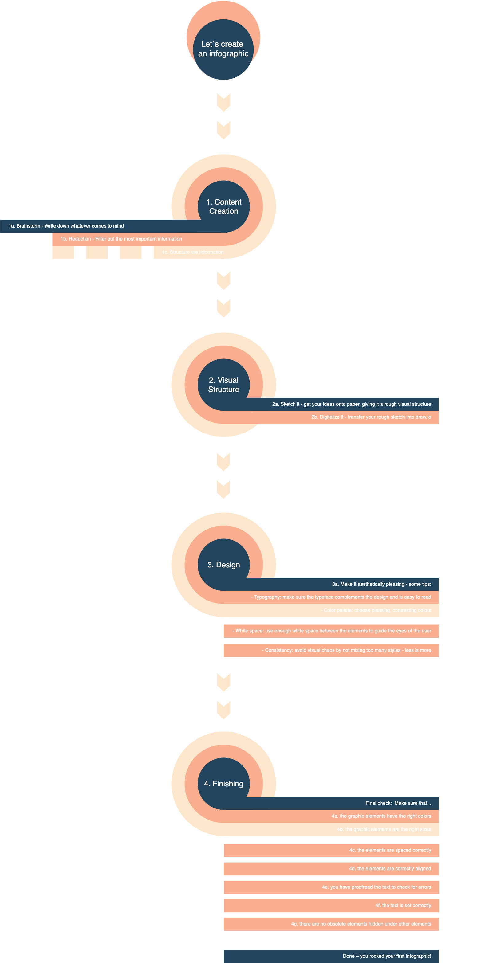
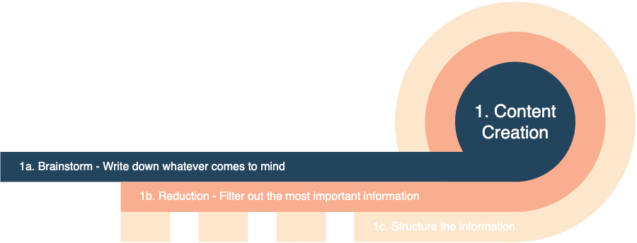
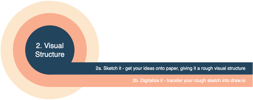
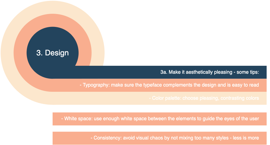
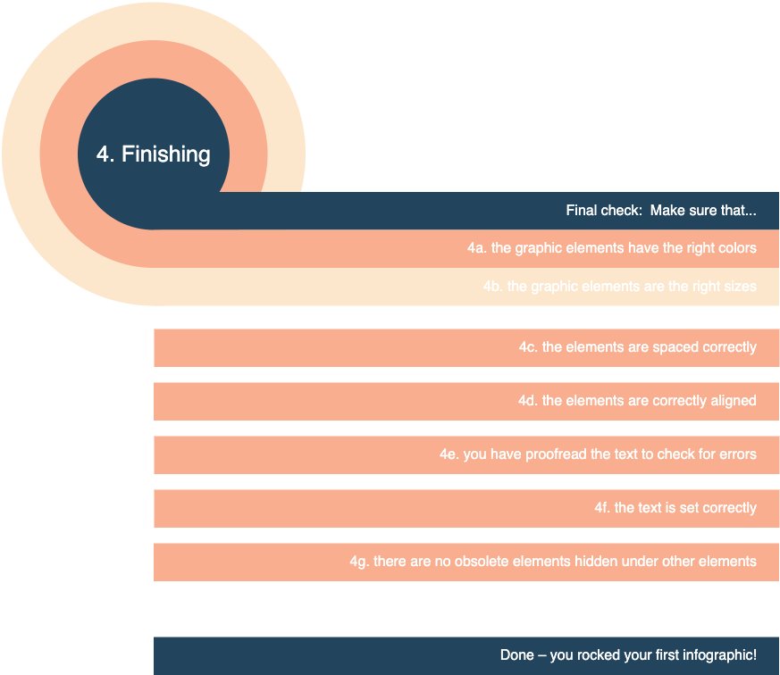
Before you begin, take a look at close-ups the infographic they created (or take a look at the full, hi-res version) to help you build a diagram that is cohesive as well as informative.
Creating the infographic in draw.io
Having information on what makes for a good infographic is great, but how do you put one together? Like with any other diagram creation process, we have a few options open to you. You can use one of the templates, so you get a feel of the structure and customize what’s there. Or, you can start with a blank workspace and let your creative juices flow!
When you start with a blank canvas, all realms of possibility are open to you. The cool thing is, it’s easy to create an infographic from scratch in draw.io. You’re going to be working with the shape library, using shapes of your choice. Then, you’ll be layering and laying them out to frame your information. Be sure to add your branding by using your company’s colors or logo. It’s limitless.
Be sure to click on the images to see the steps in action.
From Scratch
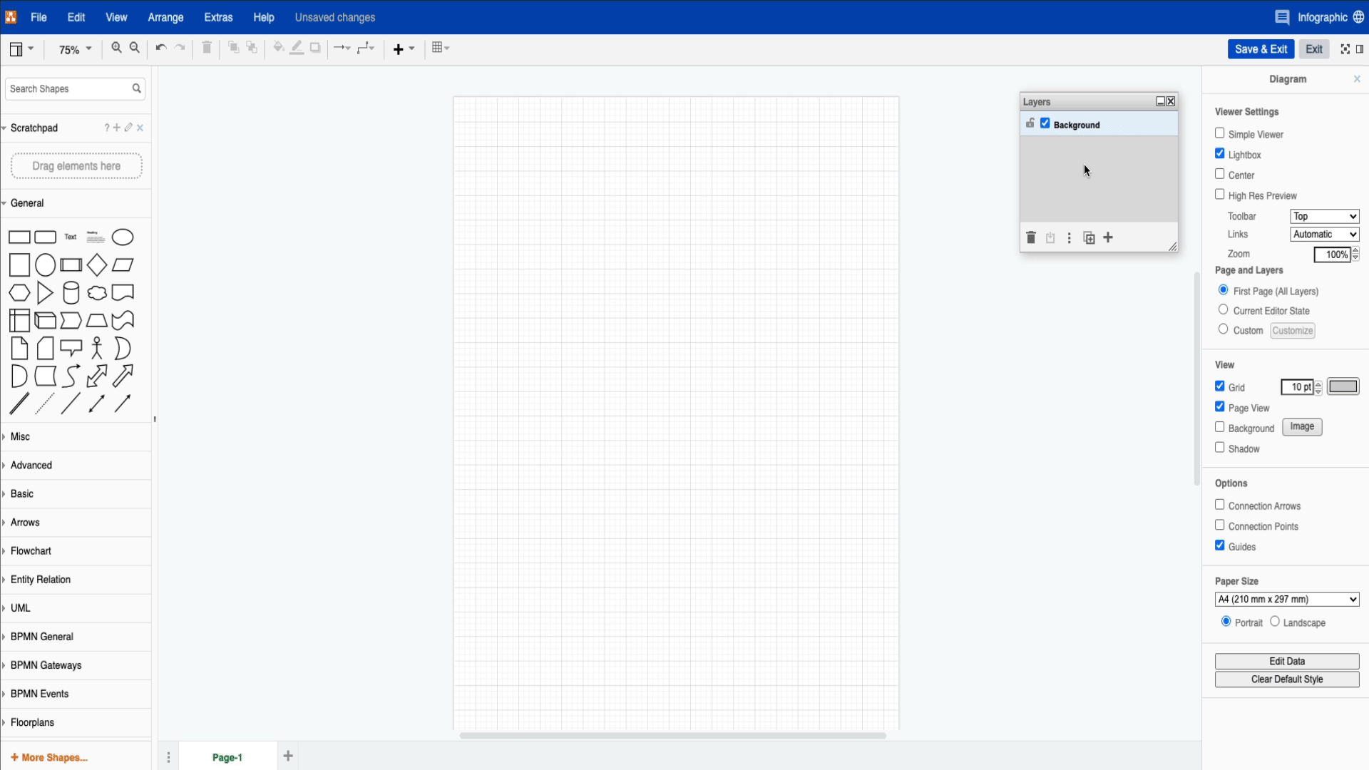
When you begin, you’ll want to disable Connection Arrows and Connection Points in the properties menu to the right of your workspace. Then o to View in your menu bar and select Layers to open the layers window. Getting both these steps out of the way before you add in your first shape will save you confusion and time. Also, generally speaking, Infographics are vertical rather than horizontal, so be sure to check the orientation of your workspace before beginning.
When you begin adding your first shape it might be a good idea for you to create a new layer for it. This can be your container and will “hold” all the other elements within it. Think of it as a drawer with many different sections. Your content is what you will put into these sections.
Things you can do to make your process easier:
- Name each of your layers so that you don’t get lost in them. Double click the layer you’d like to name/rename.
- Hide or unhide the layers so that you can work with less visual distraction. Do this by unchecking the box.
- Lock the layers so that you don’t have things moving around where you don’t want them. Click on the lock to lock/unlock.
- Group shapes so that you can move multiple shapes at once to save time. Select the shapes you want to group and use ctrl/cmd + G to group them
For more information, check out our step-by-step layers guide or our Interactive Guide on layers.
Make draw.io and infographics your own
An infographic should give you a means of communication through images, and other visualizations that you couldn’t otherwise have achieved with just writing. How you choose to make it look has to make sense for the context, but other than that – you’re free! Do you enjoy using infographics to get information? Have you ever used draw.io to create an infographic? Let us know. We’d love to hear from you and until next time, happy diagramming!
Read more about infographics in draw.io:
How to Make Infographics in draw.io
Design Rules for Infographics
Infographic: Why diagrams are important
Last Updated on May 8, 2023 by Admin