Moviemakers are masters of visual communication
Next time you watch a movie, if the camera slides or moves sideways from left to right, the scene is safe. But, if the camera slides in the opposite direction (from right to left), then the space monster or bad guy will usually appear, and something terrible is about to happen.
That’s just one visual technique used in the film industry which highlights how important design is in imparting information or telling a story.
The motion picture industry takes visualization very seriously. Film-making is the visual art of telling a story communicating an idea.
And just like film or television, good diagram design can impact what elements or graphics we look at first and how we understand the presented information or how we tell our story.
Why is this important to you
Because diagramming is more than making things look nice, it’s a means of communication.
Diagrams speak their own visual language, from selling ideas to system descriptions essential for front-line maintenance.
Diagrams can be more than just system schematics. For example, they can document meetings or marshal online sessions through visual feedback (Dynamic Facilitation). Given that draw.io is such a powerful tool in Confluence, a few small steps can help improve our diagrams assisting teams in communicating more clearly and concisely.
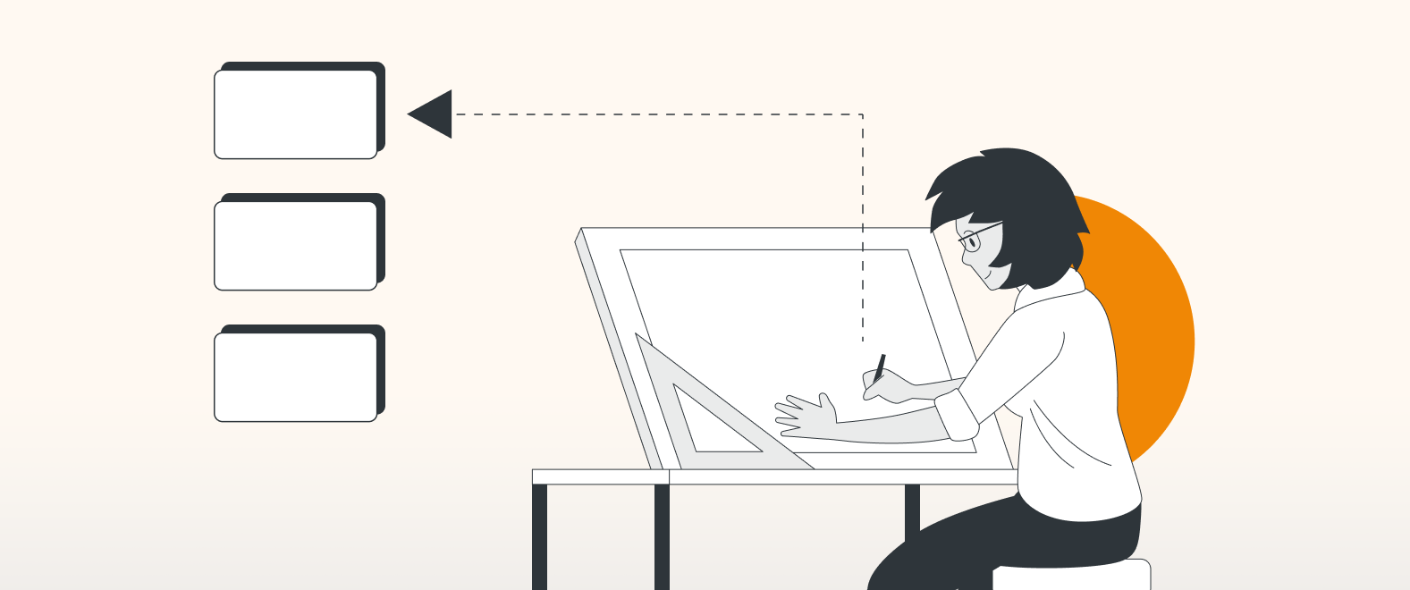
Imagine presenting your proposal for a new system to your team or even to C-level executives in your company. Diagrams can be your best friend.
We live in a visual world.
We approached one of our Graphic Designers for their thoughts on taking a diagram from average to awesome, so here are her thoughts on good design.
Arrangement
Please, no magical mystery tours around any diagram. We want clear direction.
Things that are dependent and connected should be clustered together.
Spacing is also helpful. Adding a little more space or a border can help separate different sections of any diagram.
Here we have a video playlist on creating Mindmaps. These four short videos give great tips on layout and working with shapes.
You are currently viewing a placeholder content from Youtube. To access the actual content, click the button below. Please note that doing so will share data with third-party providers.
More InformationSize
Size is a tremendously powerful indicator. Steps or processes that are essential should have bigger graphics. The eye will naturally be drawn here first. Size can be a pointer to importance. Items of equal stature should have similarly sized graphics. Creating custom shapes in draw.io is fast and elegant. See video here.
How do we do this? Well, here is a quick video example.
You are currently viewing a placeholder content from Youtube. To access the actual content, click the button below. Please note that doing so will share data with third-party providers.
More InformationColors
Color can help separate different processes in a busy diagram. We can tune our brains to ignore certain colors when following a specific thread.
Colors can also help highlight important information.
But do bear in mind specific use cases may already have dedicated color schemes, so stick to industry conventions. Again, the creative use of background colors can help in highlighting groupings. And speaking of backgrounds calm and complimentary is key, the diagram is the hero here.
In this video, you will learn how to set default colors in a project, select individual shapes or their outlines, and color those independently. Shape selection and other advanced color options.
You are currently viewing a placeholder content from Youtube. To access the actual content, click the button below. Please note that doing so will share data with third-party providers.
More InformationShapes
Use the correct shapes or industry graphics when working in specific use cases; draw.io has many built-in libraries, some are dedicated to specific use cases.
Want to find a specific shape? draw.io has you covered simply use the search function
Whatever your use case, draw.io will have a shape and a solution.
Connectors
Arrows: like shapes, arrows have specific meanings in certain use cases, so use the right arrow
Lines: Line thickness is a balancing act. The line must be thick enough to be seen but not too thick to upset or upstage the shapes.
However, line thickness can be used to measure data or process flow. Lots of data; perhaps a thicker line is in order.
Here we have two videos showing how to customize connectors. Line options and style connections and select shapes and connectors.
You are currently viewing a placeholder content from Youtube. To access the actual content, click the button below. Please note that doing so will share data with third-party providers.
More InformationYou are currently viewing a placeholder content from Youtube. To access the actual content, click the button below. Please note that doing so will share data with third-party providers.
More InformationText (Typography)
Size: it has to be legible. Squinting at text does not go down well.
Contrast: can help enormously, light-colored text on a light-colored background, no one will thank you for that. Light text on a dark background, and vice versa.
Font style: Use a font, which is easy to read. Also, the right font style is important (not too bold, not too thin). For example, perhaps your company has a corporate font. Here is an excellent opportunity to include that branding in your drawing.
Here is a quick guide on how to customize draw.io´s fonts
You are currently viewing a placeholder content from Youtube. To access the actual content, click the button below. Please note that doing so will share data with third-party providers.
More InformationSpace
Space: can also help improve things by taking diagrams up a notch in legibility.
In this short video, you can see how to adjust text spacing
You are currently viewing a placeholder content from Youtube. To access the actual content, click the button below. Please note that doing so will share data with third-party providers.
More InformationSome examples
Below are two diagrams. They both present identical information, but which one is more pleasing to the eye?
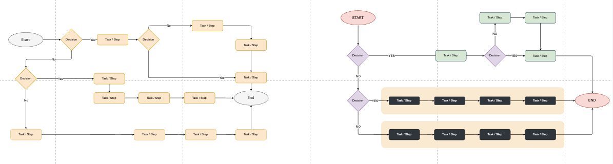
Diagram 1
In this first example, this diagram lacks any sort of order or flow, all the information is there, but it is clumsily arranged.
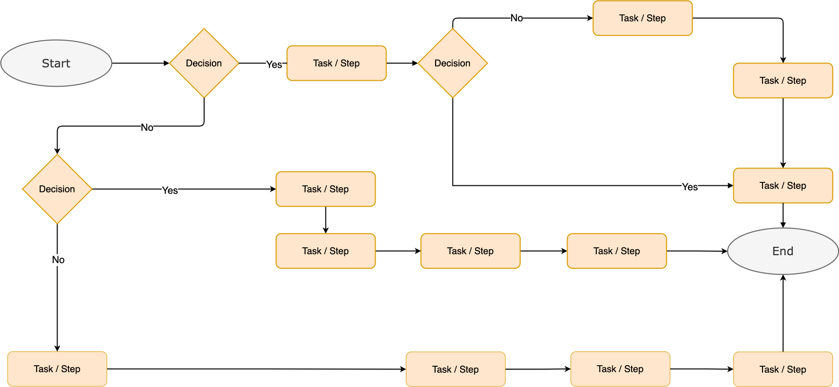
Diagram 2
Notice how this diagram below seems to flow. Is the same information as diagram 1 but presented differently.
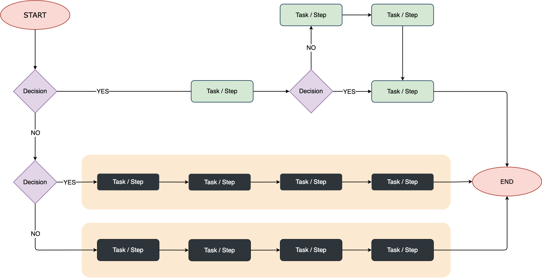
In the diagram above we have:
- Clearly defined start and stop boxes
- Clustering – tasks which are closely related are aligned in their own space and have their own colored background
- Color – used in symbols to help define each function
- Text – simple and legible
- Space – used to separate different stages of the process
Evolution of a diagram
With any idea or process, the first stage is always to get something drawn regardless of how messy or disorganized.
Putting your thoughts down in some form gives a framework to work on. What do we mean by that? Look at the following use case.
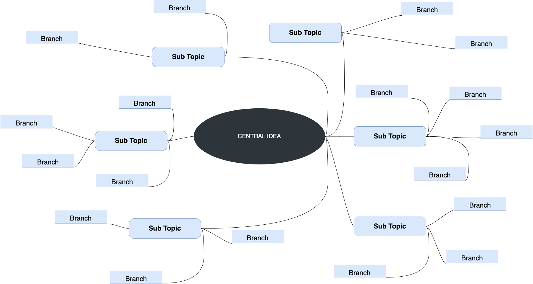
Mind Mapping example
Certainly, all the ideas are there, but it’s difficult to follow.
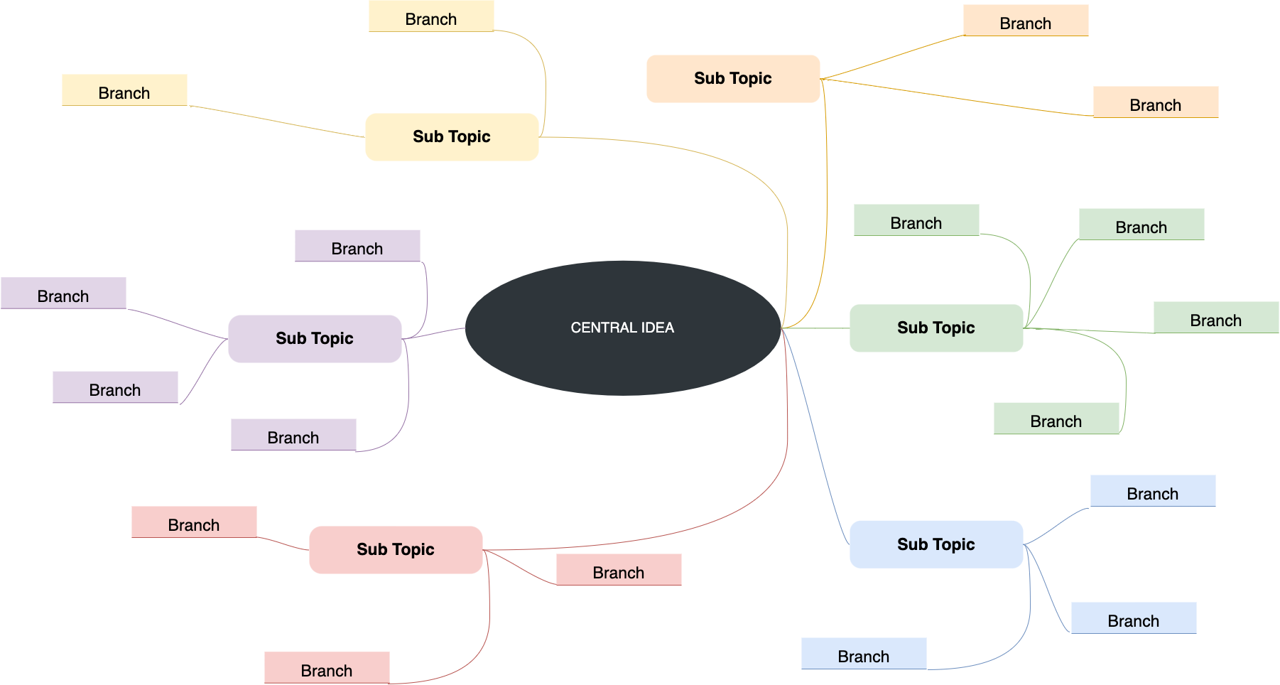
Second draft
The simple use of different colors immediately gives us a sense of connection. We can see how closely individual ideas relate to each other.
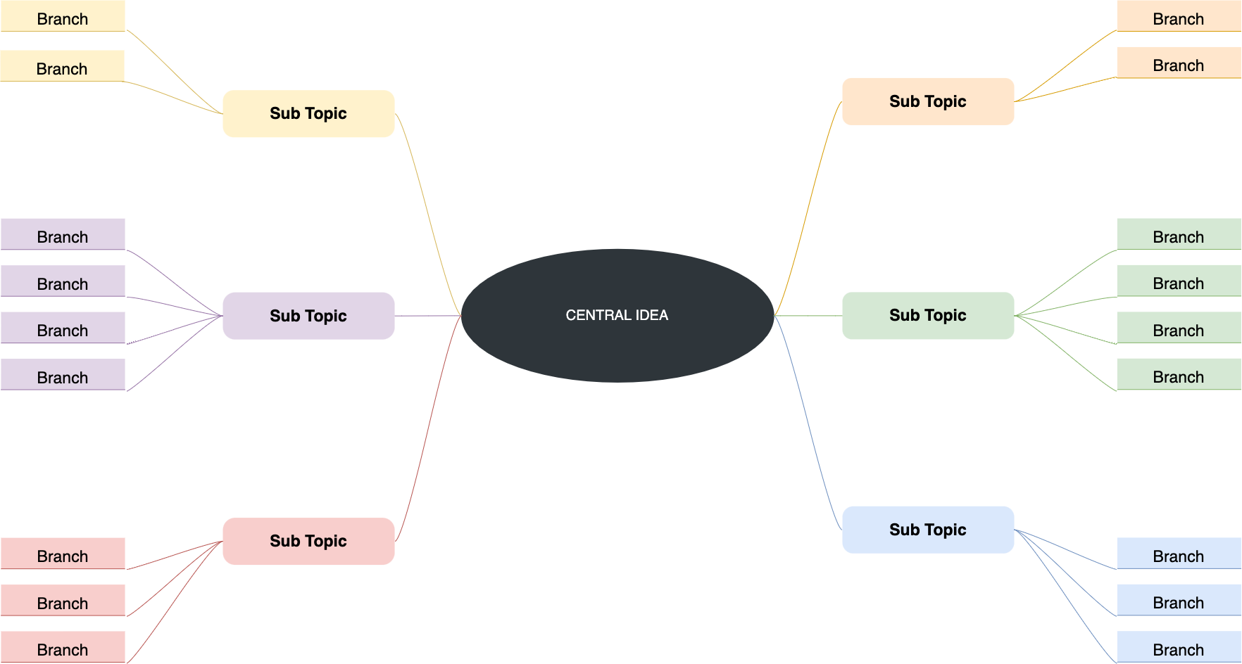
Third draft
Our mind map begins to come alive using clustering and space, offering clarity and ease of understanding.
Monotonous to Monet
So hopefully, you now appreciate how a few simple rules can take your diagrams from Monotonous to Monet.
A great diagram is a pleasure to gaze upon, offering easily digestible information.
So make time to learn how to make your diagrams even better. draw.io is an incredibly powerful tool with lots to offer.
Visit our YouTube Channel for a constantly updated playlist of how-to videos.
Or visit our one-stop tutorial shop to pick up all the ins and outs of draw.io diagramming.
Maybe even book a free demo to learn more about the limitless ways in which draw.io can make life easier and more productive for you and everyone in (and outside) your company!
We are here to help. Happy diagramming!
Last Updated on October 18, 2022 by Admin