As mentioned in my last post where I created my first infographic in draw.io, I am a writer and not a graphic designer. I went in blind, with no prior experience — neither with draw.io, nor creating infographics — and very little information on what makes a good infographic, design-wise.
I received some fantastic advice from one of our resident graphic designers, with an analogy to setting the table for a formal dinner.
Imagine that your infographic is a table laid out for a formal dinner. You want to set the dinner table as nicely as possible for each of your guests (your viewers).
Design rules for great infographics
1. Less is more
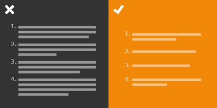
The first step is to scribble down the content you want to include in your infographic. This can be done quickly on paper.
Then reduce that content to purely the essential information. Remember that graphics and icons say more than words — you don’t need to have every detail represented by an image, especially when the image is in addition to text.
You don’t want to have four different types of glasses if you have only one type of wine or cutlery that is not used as the dinner progresses. Keep the place settings on your dinner table as simple as possible.
2. It’s all about vision-tracking
![]()
You don’t want to overwhelm your guests and confuse them with too many choices. You want to let them see each dish on the table as it is served, as well as their own place.
Your infographic should be structured to guide the viewer’s eye through the content. Make sure each separate part of the infographic is well-structured and clearly separated.
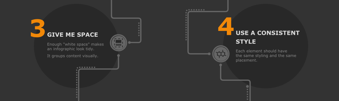
3. Give me space!
Each guest at our formal dinner table wants to know which plate, glass, knife, and form belong to them, that’s why you need to arrange everything on the table with the right amount of space around each item.
“White space” is essential in an infographic. This magical component, when there is enough of it, makes an infographic look tidy. It groups content visually, and guides the viewer’s eye through the infographic.
4. Use a consistent style
Each element, whether it is a caption or an icon, should have the same styling and the same placement.
Just like each glass on your formal dinner table has the same shape, color and structure, the knives look the same as each other, and the background is even and non-intrusive.
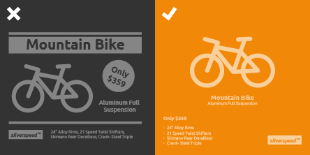
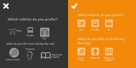
5. Don’t mess with alignment and spacing
All of your plates are the same distance from the edge of the table. Knives, cutlery and glasses are placed in the same locations relative to their plate. Just as you have created an invisible border or space around each item on the table, you should do the same with your infographic.
Use the same distance to the top, bottom, left and right edge of the infographic. The outer elements must be aligned to that border and nothing goes beyond it, similar to the words on a printed page.
Plus, each section or group of content should use the same spacing to the next, and should be strictly aligned, just like one place setting is spaced from the next at the formal dinner.
This helps the viewer ‘flow’ through the infographic, without getting caught on a single element that seems out of place.

What do you think?
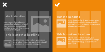
By following these design rules, the cluttered and unevenly-spaced infographic with mismatched icons that I created, was redesigned into a beautiful and simple masterpiece. ☺️
Both versions of the infographic were created in draw.io, so you can see that draw.io supports good design, and is very flexible and easy to use.
What other design rules do you think should be considered when creating infographics?
Last Updated on April 17, 2020 by Admin