The Jobs to Be Done theory is being increasingly often used by successful IT companies, including Google, Cisco, Intercom and Basecamp. It’s an approach to focus fully on the customer and their goals (jobs) as you design, develop and improve your products and services. It takes customer-centric design to the next level, as it also includes the experience leading up to the customer’s purchase and support or interaction afterwards.
In our last post, we looked at one of the first diagrams you would normally create if you follow the Jobs to Be Done approach – force diagrams. These help you detail the following two aspects, the forces that promote change (push & pull), and the forces that prevent change (fears & reasons to stay with the old).
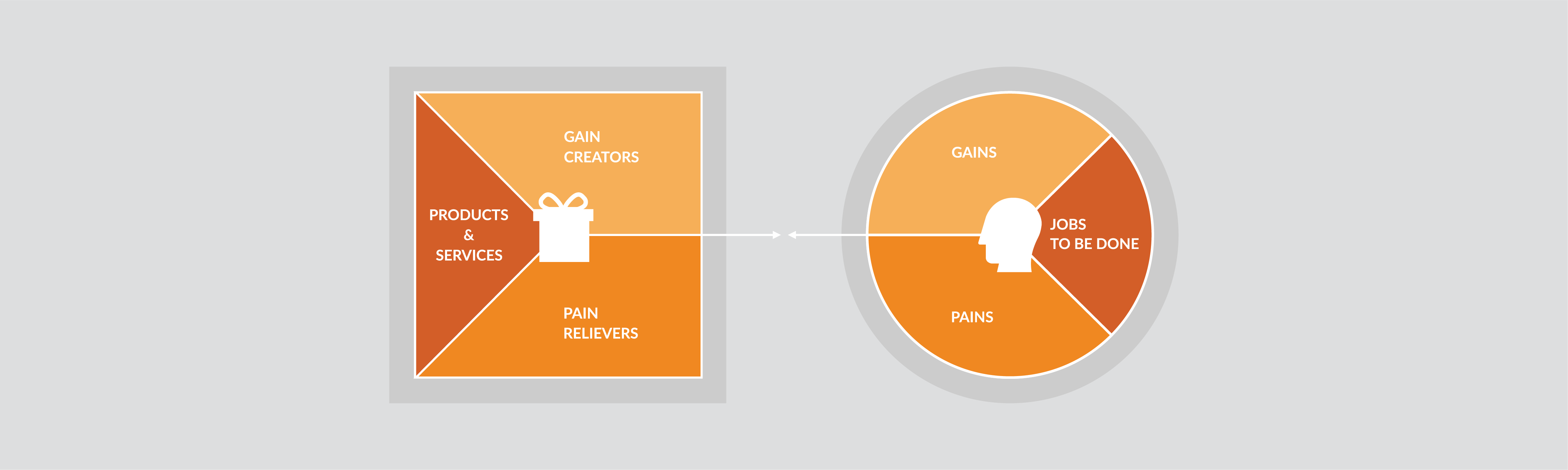
Value proposition canvas
You can reformulate these forces into pains, gains and jobs to be done on one side of a value proposition canvas, and then map them to pain relievers, gain creators and your products and services on the other.
Tip: Teams that are comfortable working with customer personas may find the value proposition canvas easier to start with than the forces diagram.
Note that each group of customers has their own value proposition canvas.
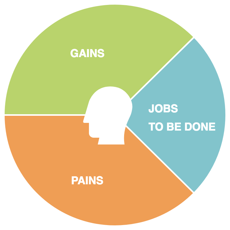
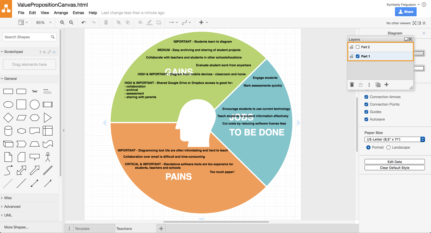
Part 1 – look at the situation from the customer’s point of view
Start with the first half of each of the diagrams – look at the situations from the customer’s point of view and include the forces that promote change (the push and the pull from the forces diagram). Next, add priorities and weights to the customer’s pains and gains. Not everything will be important, or perhaps not in all contexts. This will help you focus on the high value, important aspects.
The three sections to this part of the value proposition canvas are:
- Pains: the things that get in the way of a customer completing their job – the reasons the customer is looking for a new solution.
- Gains: all of the positive effects that the customer want to ‘gain’ from completing their jobs or from using a product or service, including their larger ambitions and desires.
- Jobs to be done: their goals – including the customer’s functional, emotional, social and supporting ‘jobs’.

Part 2 – look at existing and potentially better solutions
Once your team has done this, they can move onto the second part of the diagram. Detail everything that could enable or
amplify your customer’s gains and minimize or eliminate their pains in this second half.
- Pain relievers: what would help customers avoid or get rid of their pains and problems, fix under-performing solutions, or reduce the influences that prevent a new solution from being adopted (feelings like fear, habits, or other barriers)?
- Gain creators: what would help customers achieve their gains, make it easier to adopt a new solution, and what would make your products or services outperform what your customers currently use?
- Products and services: all of the products and services that help your customers get their jobs done (both your own products and services and your competitors’!)
Creating value proposition canvases in draw.io
When we used paper to create these diagrams, we’d fold a huge sheet in half, fill in part 1 first, then unfold the paper to fill in part 2. Creating these digitally in draw.io is just as easy.
Start with a ‘template’ – each of the two parts of the diagram has three sections.
Use layers
Put part 1 on one layer and part 2 on another layer. You can ‘hide’ the second layer to concentrate fully on completing part 1.
- To open the floating Layers panel, click View > Layers (Cmd/Ctrl + Shift + L).
- To add a new layer, in the Layers panel, click the + icon (Add layer). Alternatively you can duplicate the existing layer.
- To rename a layer, double click on the name of the layer, enter a new name, and click Rename.
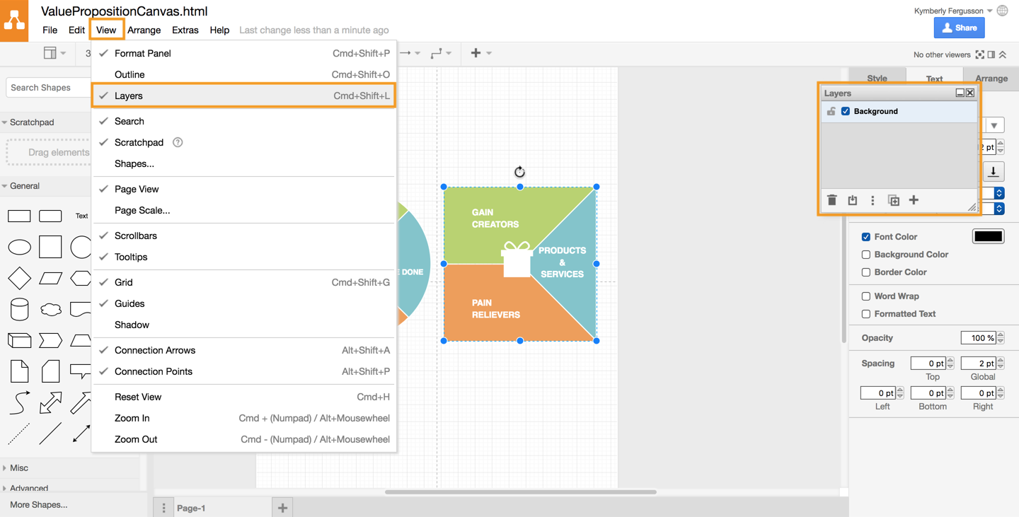
1. View the Layers panel
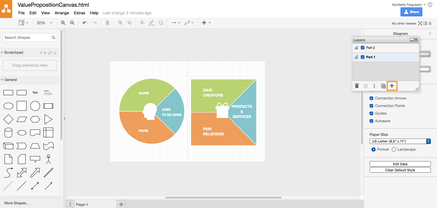
2. Add a new layer
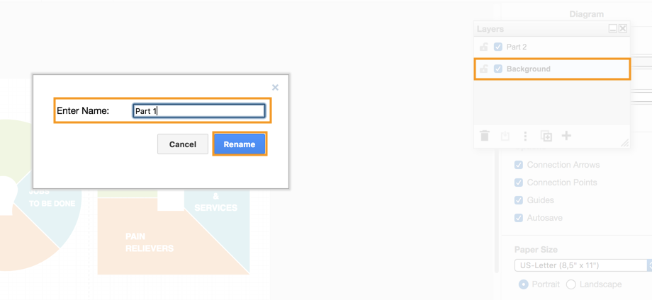
3. Rename a layer
Use a multi-page diagram
Save this as a template on one page in your diagram. To keep all of your related value proposition canvas diagrams together, you may find it useful to create a page in your diagram for each of them. In which case, rename your template page, and then duplicate it for each customer.
- Right click on the page at the bottom of the diagram to Rename and/or Duplicate it.
Here’s a useful animation of how multiple page diagrams work in draw.io
From the customer’s point of view – part 1
When you work on part 1, hide the second layer (Part 2) by making sure the checkbox next to its name in the Layers panel is not checked. Fill in this part of the value proposition canvas as if you were the customer – try to put yourself in their shoes. Or better yet, go and interview them and ask meaningful and open-ended questions to see exactly what their gains and pains are.
In this example, I’m ‘a teacher’ who needs to (and wants to) teach their students to use a diagramming tool as a way to present information effectively. There are many pains with the existing software and platforms used in schools. Plus many schools still only accept assignments on paper, despite being required to teach a ‘modern’ curriculum.
Teachers are increasingly encouraged to do classroom-level collaboration with distant schools or even students in other countries, as well as allow parents (viewing) access to their students work, and teach students with up-to-date technology and tools. These are just some of their “jobs to be done”.
Tip: Don’t forget to add importance and priority levels – this will help you in part 2.
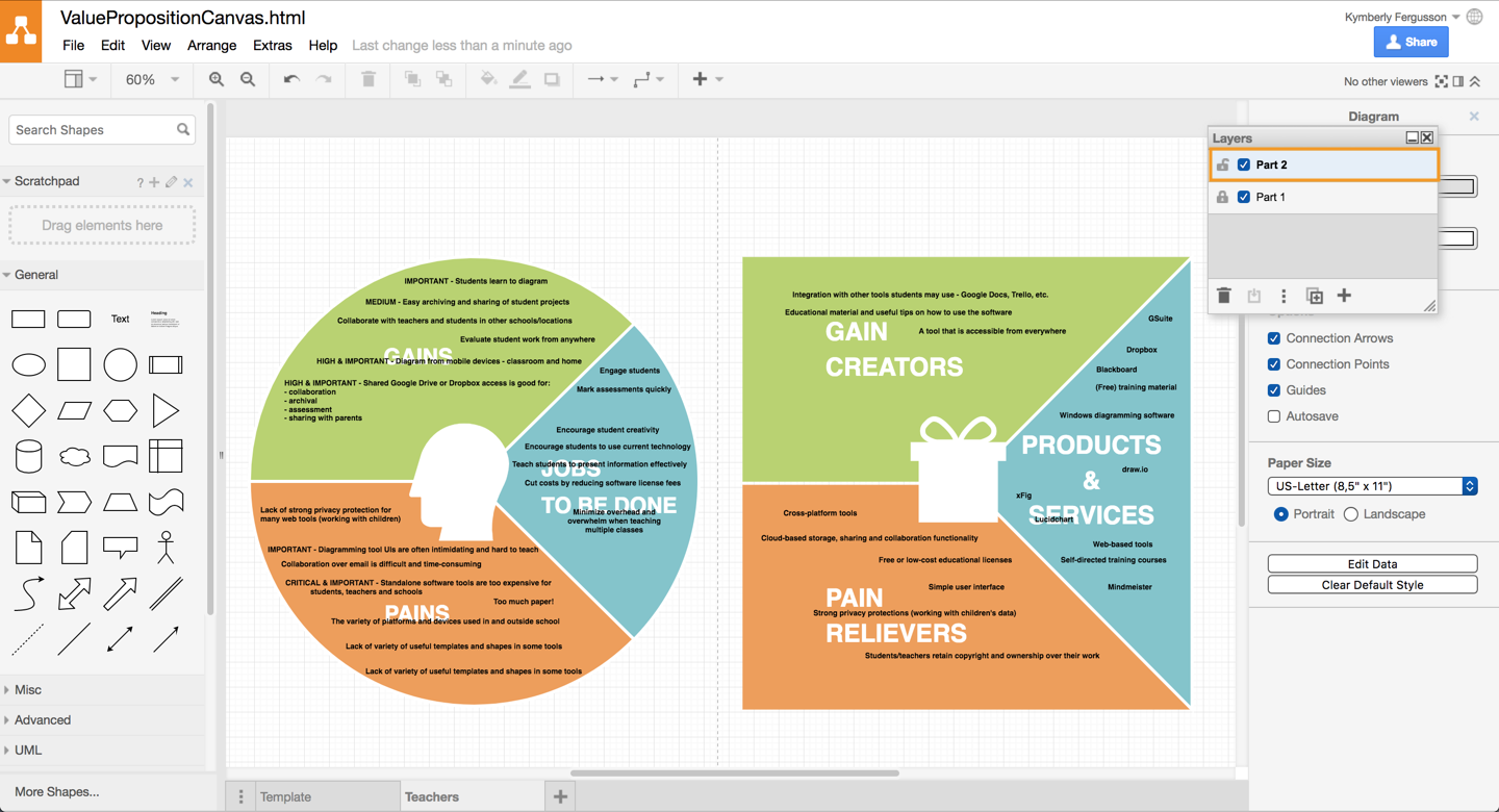
Map to solutions and existing products and services – part 2
When you have finished with part 1, you can lock it (if you don’t want to change it), and click the check box next to the Part 2 layer. It’s best to keep part 1 visible so you can look at the gains and pains and see how you can help teachers achieve them. Be creative here!
Focus especially on pains and gains that are critical or high importance or priority for the customer. You can ask your customer for their ideas too – they may be able to be more creative than you can, particularly if you are already very heavily invested in your own product and services.
Note, part 2 will probably take you much longer than part 1.
Important: In draw.io make sure you select this layer (light blue) in the Layers panel so when you add text it will go in the right spot!
draw.io helps you get your jobs done
It’s the job of teams to help their customers get their jobs done. Atlassian Summit 2018 was all about helping and celebrating teams, and as we were a Diamond sponsor, we took the opportunity to craft a white paper explaining how you can use diagrams to improve the Jobs to be Done approach.
Help your teams focus on helping your customers get their jobs done!
We’ve already covered how you can create the Jobs to Be Done force diagrams with draw.io, and now in this post, the value proposition canvas. Next up will be customer journey maps – stay tuned!
Last Updated on April 9, 2020 by Admin