Visual communication has quickly risen to be the dominant form of communication on the web, and is increasingly used within corporate intranets.
In fact, diagrams are more popular than text when presenting certain types of information, particularly dense information.
But why are diagrams so useful and so often used?
We learn and remember visually
Our brains are designed to process information visually. We can see a pattern much more easily than a list of numbers.
Pictures are easier for our brains to comprehend than words. The picture superiority effect ensures we remember graphical information more readily than anything that we read.
Visual IQ is increasing faster than other forms of IQ
Humans are getting cleverer, the average IQ is increasing. However, the three-point per year rise in IQ scores is not reflected in school test results, which focus on vocabulary, arithmetic and memorized information.
Instead, our visual IQ is increasing rapidly — we are getting much better at recognizing and matching patterns as tested by the Raven’s Progressive Matrices.
Text with images has more impact
When studying types of presentations, the researchers at the University of Minnesota and 3M discovered that presentations containing “good” graphics were 43% more persuasive than pure-text presentations. Visual aids, especially in color, improved the audience’s attention, comprehension, agreement, retention, and action, as well as their opinion of the presenter’s credibility, preparation and professionalism.
This is why infographics are so popular – they present interesting information concisely and memorably, in a format that is easily sharable.
We don’t have time to read
The world is drowning in information. Everyone must process more information than ever before, often under intense time pressure. There is not enough time to read long slabs of text.
The Nielson Norman Group has studied how users read on the web (and by extension, in intranets), and found that users read only about 25% of the content on a page. Pretty but irrelevant stock photos were completely ignored, but users spent significantly more time looking at explanatory diagrams and real photos.
Good diagrams support skimming, the most popular method of reading both on the web and in corporate intranets.
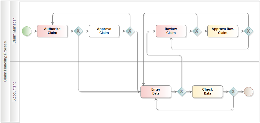
The process for handling claims is easily and quickly understood in a diagram.
Diagrams convey more information in less time
Imagine trying to convey an organization’s management hierarchy with pure text. Or describe a complex business process with many decision points without any supporting graphics. Or try to explain a circuit board layout. Or even a simple room layout.
It sounds like a nightmare. Any reader would quickly give up.
Which is easier to understand, the following diagram or the text?
The American political system is broken into three parts. The Legislative branch consists of the Congress and the Senate and proposes legislation.
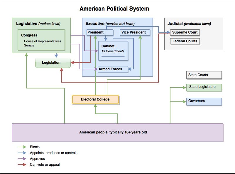
Legislators are elected by the American people. The Executive branch carries out the legislation, and consists of the President, the Vice President, the Cabinet and the Armed Forces. The Cabinet represents 15 departments, and these representatives are appointed directly by the President, but need to be approved by Congress. The Judicial branch evaluates legislation. The supreme court representatives are appointed directly by the President. Both the President and the Supreme Court can veto or appeal legislation. The American people elect people into the Electoral College, who then elect the President, and the Vice President. In addition to the federal political system, states have their own courts, legislators and governors.
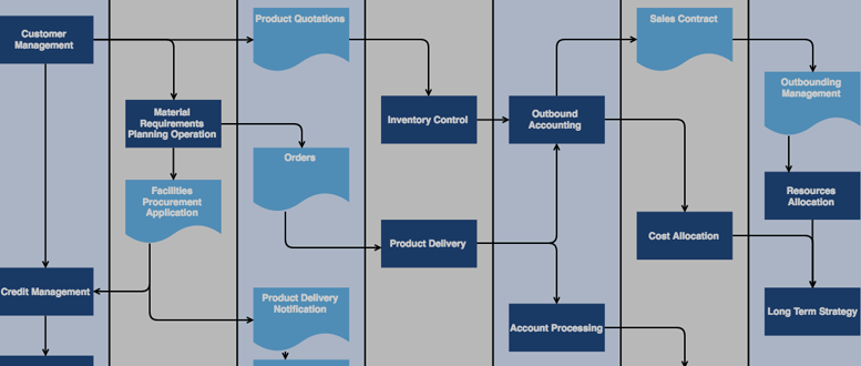
Could a diagram of a company’s sales process more clearly explain the process? Definitely. Diagrams are concise: Visualization is great for communicating dense and complex information, and as a result, improving productivity. Employees can understand the diagram clearly, they have fewer questions, make fewer mistakes and are more productive.
Try to clearly explain the following diagram in text, I dare you!
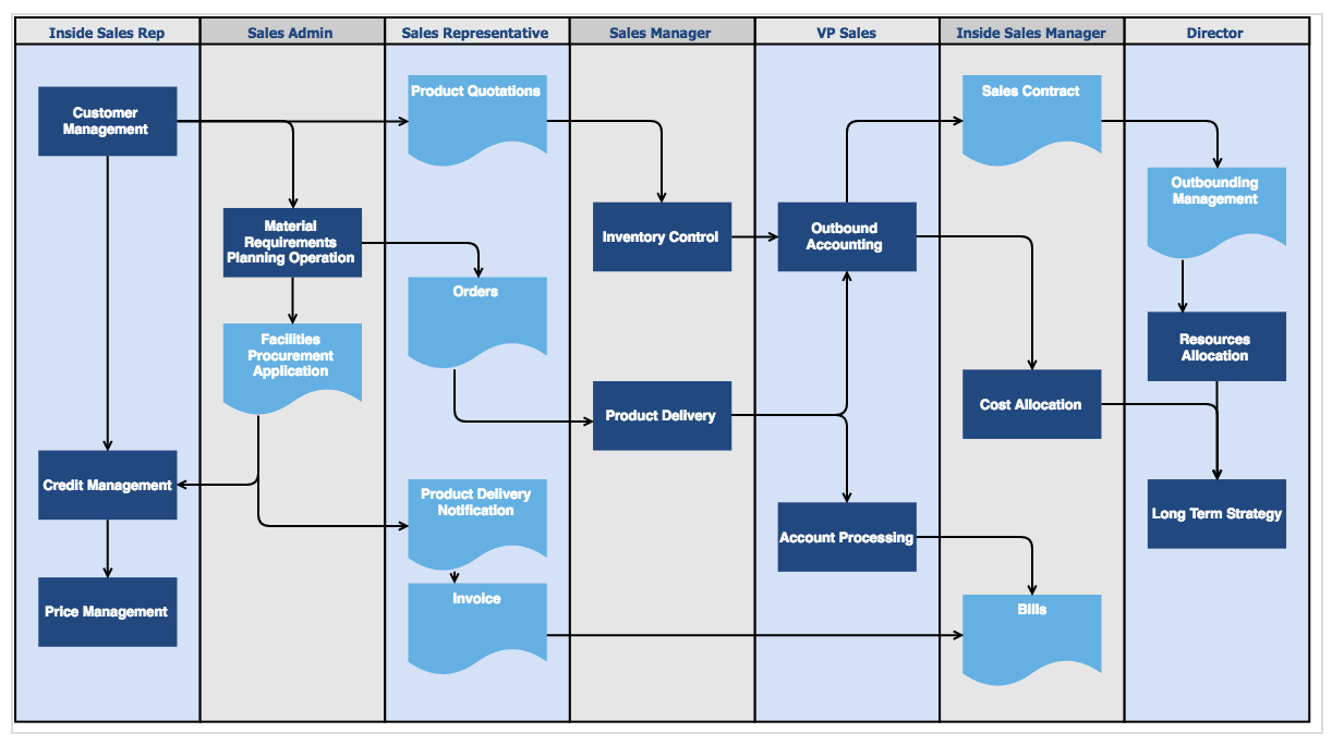
A diagram concisely explains this sales process, which would be nigh impossible in pure text.
Visual information smashes language barriers
Most industries are becoming more and more globalized, with customers, offices, partners and employees all around the world.
Representing instructions and procedures in a diagram, such as the sales process above, makes it easier for international colleagues and partners to work together, and allows new employees to come on board smoothly.
And last, but not least:
Diagramming helps design and planning
From mind-mapping for executive planning, modeling relationships in a business model, designing layouts for software interfaces, creating process diagrams to optimize business procedures, and mapping factory layouts for manufacturing, diagramming has always been a part of exploring and optimizing solutions in all of areas of business.
Even writers and editors use mind maps and hierarchical diagrams to structure documents and books.
Rough sketches and visual prototypes leave less room for interpretation than a written description, reducing misunderstandings, wasted time, and producing an optimal solution faster.
Diagramming is for everyone
Companies need all of their internal communication to be developed and maintained (to live) in their intranet and not statically hidden on local computers. That includes diagrams, which can be collaboratively developed and adapted at any time, which are audit-proof and traceable, with the full range of tools and functionality.
Tools like draw.io for Confluence offer a powerful and easy-to-use solution that everyone in an organization can take advantage of both for development of ideas and the presentation of information in a concise, memorable and understandable way.
Further information
The draw.io website and blog
draw.io: Professional Diagrams in Confluence and JIRA
Draw.io diagramming in Confluence: Cheat sheets for beginners
Diagrams with draw.io for Confluence: Work with custom libraries
Last Updated on April 17, 2020 by Admin