This blogpost is part of our In-Shape campaign series. The other topics we looked at include:
Perspective is everything
Humanity has come leaps and bounds with advanced technology, medical breakthroughs, and artistic and cultural revolutions. Over the course of history, pioneers have accomplished spectacular achievements, setting the stage for us today and paving the way for advancements that infuse every possible aspect of life.
In our last blogpost of the In-Shape series, we have curated 5 diagrams that have revolutionized the way we think, feel, and visualize, and discover their continued impact on humankind today.
Enter: draw.io’s Diagram Hall of Fame!
1. da Vinci’s Vitruvian Man: A symbol of harmony
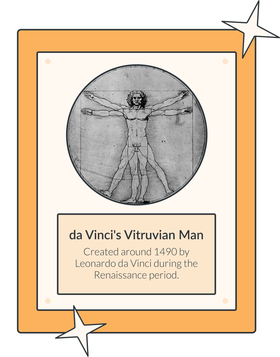
Considered to be one of the all-time iconic images of Western civilization, da Vinci’s Vitruvian Man represents the “perfect man”, inspired by the writings of the Roman architect Vitruvius.[1] The drawing captures the concepts of balance, harmony, and the perfect ideals of the human form. Its enduring popularity since its creation captivates and inspires people even today, and has ensured its place in our Diagram Hall of Fame.
Due to the fragility of the original drawing, it cannot be exposed to light for extended periods of time, and it is usually kept in a climate-controlled, locked room on the fourth floor of the Accademia Gallery in Venice.[2] In 2019, there was even a petition to ban the drawing from being transported to The Louvre, to mark the 500-year anniversary of the death of Leonardo.[3] (Fortunately, your draw.io diagrams are expertly preserved and showcased in Confluence, safe from the perils of time, oxygen, and light from spoiling their pristine condition!)
The Golden Ratio
Balance and harmony are often subtle, but essential aspects of visualizing effectively. Get the proportions wrong or inconsistent, and it detracts from the central focus of your diagram.
With draw.io you are able to maintain aspect ratios of your shapes while resizing them. Simply click on a shape, head to the Arrange tab in the right side menu, and check the box, “Constrain proportions”. For an even quicker way to do this, see our shortcut video, How to keep shapes proportional and centered while resizing in draw.io.
2. CO2 Scrubber from Apollo 13: Accounting for every eventuality
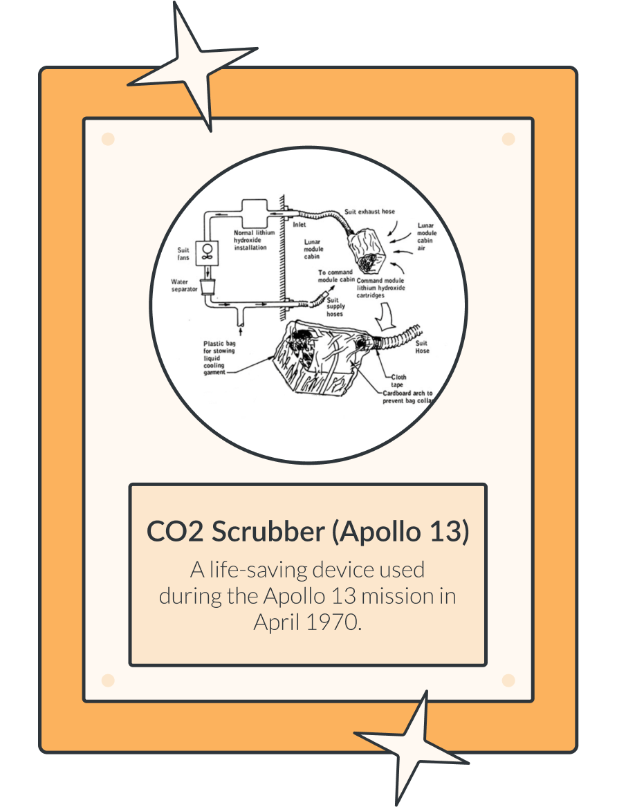
When we hear “Apollo 13”, one of the first things likely to spring to mind is the 1995 movie. In the movie, as in real life, an explosion cripples the Apollo 13 spacecraft, resulting in the three astronauts using the Lunar Module for much of the return flight. The problem? The Lunar Module was designed only for two astronauts, adding a third to the spacecraft would result in a fatal overabundance of carbon dioxide.
Mission Control and the crew had a seemingly insurmountable challenge: to keep the three astronauts alive on their return voyage. Complicating things even further was that Mission Control based in Houston was unable to send pictures to the crew. They therefore had to describe everything in detail verbally, and hope the astronauts got the picture. NASA’s engineers put their heads together to come up with a workaround, using command module scrubbers available in the lunar module.[4]
Key learnings
In business as in life, nothing is plain sailing, and things can and do go wrong. Accounting for all eventualities helps mitigate the risks to an extent, but equally important is learning from critical incidents: what went well, and what can we do in future to reduce risk, prevent repeating mistakes, and improve?
Our blogpost, draw.io for Agile Retrospectives, provides a variety of templates for you to use. They will help guide your team retrospectives, ensuring these are productive meetings where no stone has been left unturned, no man left behind as each colleague has had their voice heard, and your processes are optimized to be absolutely out of this world!
3. Copernicus’ Heliocentric Model: Turning what we know on its head
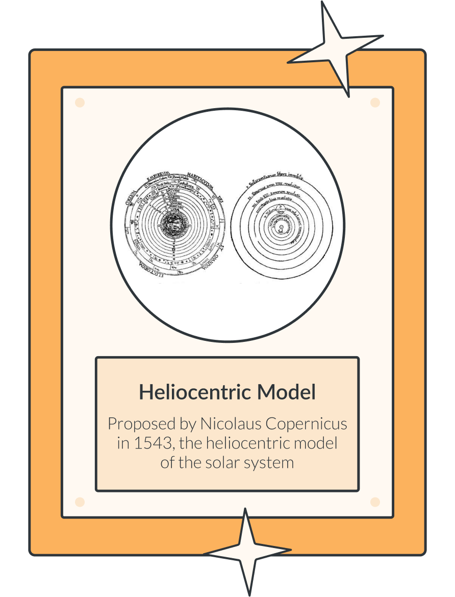
Copernicus (1473–1543) was a mathematician and astronomer who proposed that the Earth and the other planets revolve around the Sun, which remains motionless at the center of the universe. This is a fact that is taught in schools, and few would question today. However, it was highly controversial at the time, going against everything we’d understood before, namely Ptolemy’s geocentric model that placed Earth at the center of the universe. As a result, most astronomers remained unconvinced by Copernicus’ model for centuries, right up until about 1700[5].
Fortunately, later on, with a little help from our friends Galileo Galilei and Johannes Kepler, the heliocentric model gained wider acceptance and eventually became the foundation of modern astronomy that we know today.
Challenge your way of seeing things
It’s good to challenge the status quo and our usual way of thinking. This exercise can test the robustness of ideas we would like to go ahead with, as well as ensure what we are currently doing is up to scratch. For a fun, “flipped” way to brainstorm that will challenge the way you approach tasks, check out our template below: 6-3-5 Brainwriting.
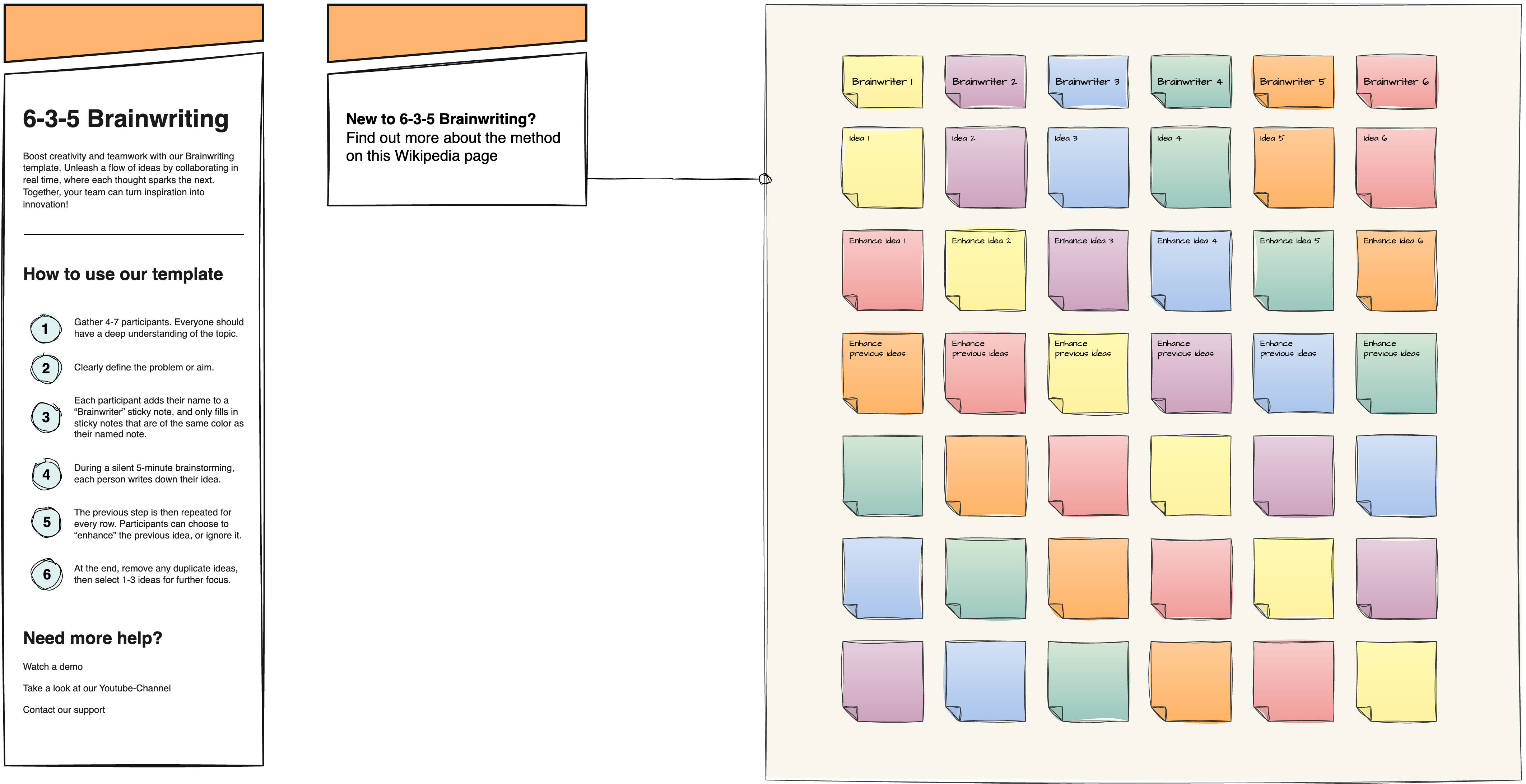
- Open Confluence.
- Open draw.io (blank diagram).
- Drag & drop your XML file into your blank drawing area.
- Use it as a custom template if you like.
4. Moses Harris’ Color Wheel: Putting theory into practice
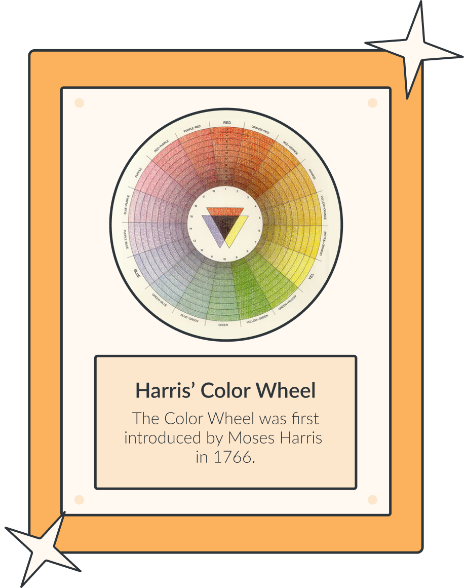
Moses Harris (15 April 1730–1787) was a naturalist, entomologist, and engraver. He was also an accomplished artist, with his drawings of insects featured at the Royal Academy in 1785.[6] All of these aspects of his life and career set the backdrop for the development of his color wheel, and was meant to serve as a practical guide for artists.[7] Primarily, it represents how a range of colors can be created from red, yellow, and blue.[8] The wheel consists of a circular arrangement of colors, typically six or seven, illustrating their relationships and organization.
Drawing on his knowledge of nature, Harris’ descriptions for colors were based on substances, fruits, or flowers:
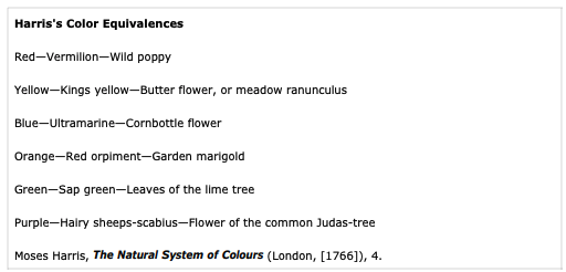
Although more modern versions of the color wheel have been developed since, Harris’ color model had far-reaching implications. It paved the way for the development of revised color systems, which continue to be used in art schools and artistic environments today.[9]
Add a splash of color to your diagrams
In draw.io, there are plenty of text, image, and color customization options for you to play with, in order to create bespoke diagrams and whiteboards tailored to your and your organization’s needs. For more information, see our blogpost, Customise default colours, fonts, styles and the draw.io UI in Confluence Cloud.
5. Watson and Crick’s DNA Model: Laying the foundations
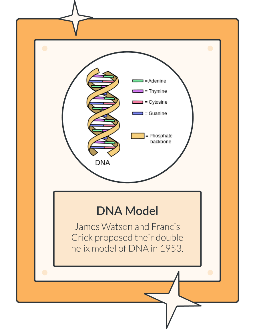
Last, but certainly not least, the final diagram featured in our Hall of Fame: Waston and Crick’s DNA Model. Plenty of scientists were racing round the clock to crack the compositional code of DNA and how it was structured, but it was ultimately Francis Crick, Rosalind Franklin, James Watson, and Maurice Wilkins who co-discovered the double-helix structure. Watson, Crick, and Wilkins went on to be awarded the Nobel Prize for the discovery.[10][11]
The double helix structure is synonymous with our understanding of the human genome and how life can exist, and has had a fundamental impact on modern science and medicine.
Scientific discoveries seldom tend to result in a clearly-defined, “eureka” moment, and it’s important to take a step back and consider how this revolutionary DNA model developed over time. “Scientific discoveries may seem like sudden breakthroughs — the work of a genius who just “sees” the answer — but new findings don’t come out of nowhere. Each breakthrough is made possible by the work that came before it. Some scientific discoveries are a bit like putting together the pieces of a puzzle.”[12]
Building on strong foundations
Like scientific discoveries relying on a clearly defined model of DNA, the best diagrams are those that are clear to read and built on strong foundations. To avoid your diagram from becoming too confusing and cluttered, you can use layers to build up your draw.io diagrams from simple to complex. This also gives your diagram viewers the ability to choose the level of detail they need to see.
To find out how to build your diagram using layers, see our blogpost, Interactive diagrams with custom links and actions.
Your breakthrough discovery
These diagrams and visualizations were designed by innovators with a vision, and founded on countless breakthroughs and ideas leading up to their pinnacle discovery.
We hope the diagrams featured in our Hall of Fame inspire you to visualize something truly remarkable, and possibly even come up with the next big breakthrough…*
*And if you do, do make sure to give credit to draw.io when you become massively successful!
Resources
[1] Gorman, M. J., The Vitruvian Man
[2] Ruiz, C., If Leonardo’s Vitruvian Man goes on show at the Louvre, we won’t see it again for a decade
[3] Solly, M., Leonardo’s ‘Vitruvian Man’ Is Headed to the Louvre Despite Italian Scholars’ Protests
[4] Space Center Houston, Apollo 13 Infographic: How did they make that CO2 scrubber?
[5] Gringerich, O., The Book Nobody Read: Chasing the Revolutions of Nicolaus Copernicus
[6] Natural History Museum, Moses Harris (1730- c.1788)
[7] Royal Academy of Arts, The Natural System of Colours
[8] Silvestrini, N., Moses Harris
[9] Briggs, D., The RYB hue circle or “artists’ colour wheel”
[10] Science History Institute, Francis Crick, Rosalind Franklin, James Watson, and Maurice Wilkins
[11] Cobb, M., and Comfort, N., What Rosalind Franklin truly contributed to the discovery of DNA’s structure
[12] Stuart, S., The right timing
Want to dive deeper into the world of draw.io? Access our linktr.ee page to follow us on social media and learn how others use draw.io, as well as pick up some helpful tips and tricks.
Not using draw.io yet? Convince yourself and start your free 30-day trial today. Or book a free no-obligation demo with our customer success team to learn more about how draw.io can make life easier and more productive for you and everyone in (and outside of) your company!
Happy diagramming!
You are currently viewing a placeholder content from Youtube. To access the actual content, click the button below. Please note that doing so will share data with third-party providers.
More Information
