As the world is becoming more visual and time poor, infographics have become extremely popular.
Infographics capture the attention effectively, present complex information clearly, and can be easily shared.
As well as their typical use on the internet in social media, infographics can be used to distribute information to employees. They are also great to enhance learning and knowledge retention, and can even be used to present ideas or project results.
draw.io makes it easy for you to create your own infographics.
Note: I am both a newbie to draw.io and am predominantly a writer. I am absolutely not a graphic designer!
Step 1: Write your content and design your layout
The most important element of an infographic is the information you want to include. I find it easier to do a rough draft on paper, to see how each element can be represented graphically, and which layout looks the best.
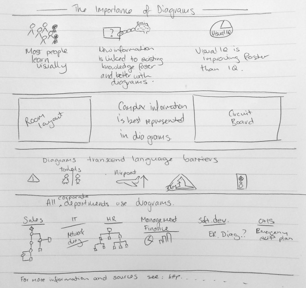
Draft the infographic roughly (on paper).
Make sure your infographic flows logically – you don’t want your audience to be confused.
Note: If you are basing your infographic on external statistics and data, make sure they are reputable and recent – there is a lot of false, misrepresented and outdated data on the internet!
Step 2: Choose an icon set and color scheme
There is a wide range of icons built into draw.io which you can use to create attractive infographics. Simply enter a search term and press enter to view a collection of related elements.
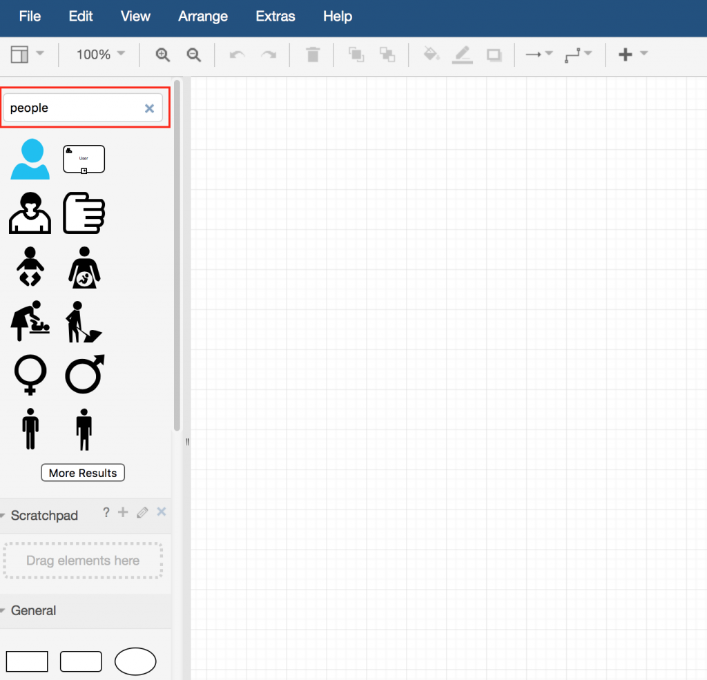
Search for an infographic element in draw.io.
It is best to select icons that are stylistically similar. Obviously mismatched elements will make your infographic look rushed and unprofessional.
If you don’t find any usable icons within draw.io, you can add your own icons and elements to a custom library.
A consistent color scheme holds the information together, making your infographic look more professional and have more of an impact.
- Choose colors that are complementary for similar information, and significantly different for opposing data.
- If you use a colored background, make sure everything is clearly readable.
Step 3: Create the infographic
Now it’s time to build your infographic step-by-step in draw.io. The following tips will help you as you add elements and text:
- Resize, recolor and rotate elements
- Use the alignment indicators to position them appropriately.
- Group related elements together once they are in the right positions, relative to each other. You can then move, rotate, and resize them as a group.
- Add horizontal or vertical lines as separators.
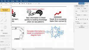
Group elements together in the infographic.
Step 4: Cite your sources
It’s important to include where you got your information from, especially when you are citing data collected by third parties. If you used a graphics collection from an external graphic artist, you may need to link their profile.
But you don’t clutter a list of sources, so it is best to include one link at the bottom of the infographic, leading to a page where all your sources are cited. This can be in the company intranet, a blog post, or a webpage on the internet. This ensures your infographic looks well-researched, clean, and professional.
Step 5: Publish!
Now it is time to publish your infographic, either electronically or on paper.
If you have created an infographic for the web, the following tips can help you spread the word when it has been posted online:
- Export and publish it as a PNG or JPEG file, so it can be easily shared.
- Share it on social media channels like Twitter and Facebook, and pin it on Pinterest.
- Make the page your infographic is hosted on as user-friendly and attractive as possible.
If you are hosting it in your Confluence intranet, the draw.io add-on supports indexing of the text inside your diagram, making it easy to find when someone searches for a word contained in the infographic.
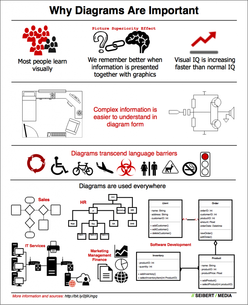
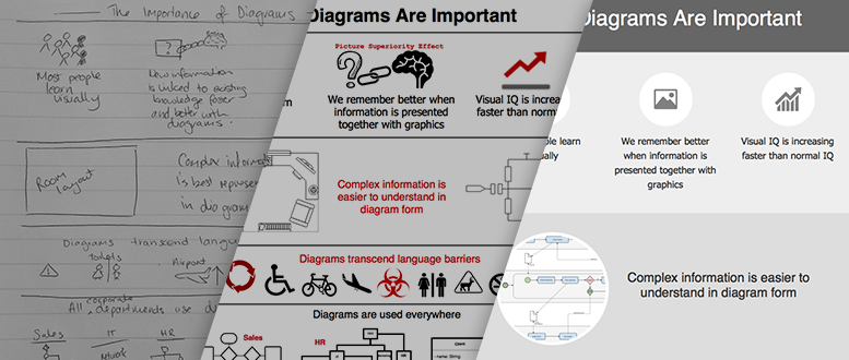
My first infographic: Why Diagrams Are Important
My infographic is too busy!
I sought feedback from one of our graphic designers, and while she loved the content, she said that I had put too much on the page – like most writers tend to do. Whoops!
I should have kept it simpler, used more whitespace, used elements of the same or similar size and shape, and aligned everything evenly. We will be publishing a design guideline for creating infographics soon.
She has cleaned up my first attempt wonderfully, also in draw.io, and created a beautiful infographic that is exceptionally readable!

A graphic designer improved the infographic: Why Diagrams Are Important. Go to the (infographic) diagram …
Infographic sources
- Most people are visual learners: http://www.uab.edu/uasomume/fd2/visuals/page1.htm
- Picture superiority effect: http://en.wikipedia.org/wiki/Picture_superiority_effect
- Visual IQ is increasing faster than IQ: http://www.bbc.com/news/magazine-31556802
Further information
Cheat sheets for draw.io beginners: learn how to use the tool quickly and efficiently
Custom libraries make creating infographics in draw.io easier
Why are diagrams so powerful?
Last Updated on April 17, 2020 by Admin